
Dennis Pentier, a 48 year-old Jamaican immigrant, has been homeless here in New York City for the past eight years. Ejected from a city shelter, he survives day to day from his makeshift outdoor shop on a block in the Tremont neighborhood that he currently calls home.
Archive | Unemployment by the numbers

A different kind of corner store: A story of surviving homelessness
Posted on 17 October 2018.
Posted in Bronx Beats, Bronx Blog, Bronx Neighborhoods, Bronx Tales, Community Resources, Culture, Featured, Housing, Morrisania, Morrisania, North Central Bronx, Politics, The Bronx Beat, Unemployment by the numbers0 Comments
INTERACTIVE MAP: Bronx unemployment by neighborhood
Posted on 01 December 2011.
This interactive map displays the 2010 unemployment rates for each Bronx neighborhood. The darker shade green represents a higher rate of unemployment. Click on each neighborhood to see its statistics and poverty rate. SOURCE: 2010 American Community Survey 1-Year Estimates
Posted in Unemployment by the numbers0 Comments
Graphic: Unemployment rates in the Bronx from 2005-2010
Posted on 01 December 2011.
Report problems to embedding@chartle.net The chart above shows the effects of the 2008 recession on the soaring unemployment rates experienced in the Bronx, NYC and the nation at large, as well as the gradual economic recovery during the last year. Although the Bronx mostly mirrored economic trends taking place in the rest of the country, […]
Posted in Unemployment by the numbers0 Comments
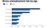
Interactive: Bronx unemployment by age
Posted on 01 December 2011.
iChart:bronxunemploymentbyage Tags:
Posted in Unemployment by the numbers0 Comments